T-Shirt proposal
 judebert
familEE
judebert
familEE
I've been working on this for a week or two, and I'm looking for constructive criticism. If you don't like it, fine, but don't bother telling me unless you can think of a specific modification that would improve it.
I've got a Cafe Press shop, and I'm thinking of putting this graphic on a T-Shirt:
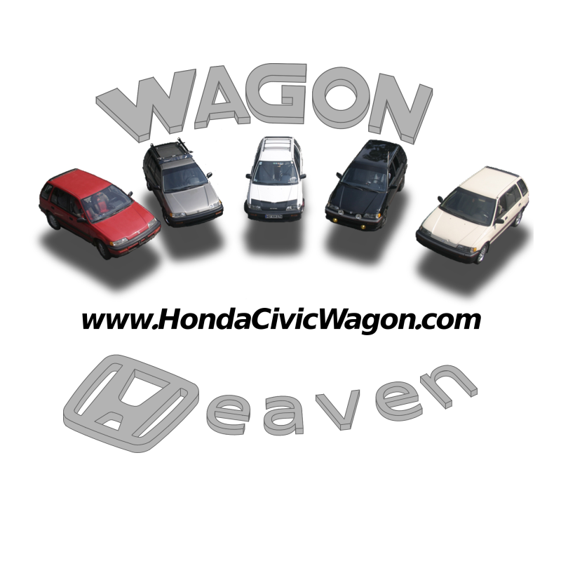
Would any of the members here be interested? Any changes you'd like? I'd be making $2 off each shirt, and I'd give $1 to the forum.
I've got a Cafe Press shop, and I'm thinking of putting this graphic on a T-Shirt:
Would any of the members here be interested? Any changes you'd like? I'd be making $2 off each shirt, and I'd give $1 to the forum.
Comments
Looks pretty good
I fully agree! I hear there's a big meet coming up; if somebody gets me nice high-resolution images, I'll make up t-shirts.
i was thinking th same thing. i'de buy one of those if the price was right
Also maybe darken up the text a bit but leave the sides the grey it currently is.
I can lighten the drop shadows, but I figured the idea was to have the cars hovering, like angels in heaven. I left out the halos because it was just too busy.
Price would be somewhere around $13 - $15.
I could put in a blue wagon, but I'd need pictures. I'm not sure it could be added to the current wagons; that would require a perfect picture. (If taken in the correct perspective, I suppose I could wedge it in second from the right.)
Of course, if we get a better group of wagons at the next meet, with a nice picture (2000+ pixels wide), I could swap that picture in with very little trouble.
There will be at least ONE blue wagon at the next meet...
What font is the HCW sticker in, anyway? I just can't seem to match the lowercase g! I don't want to draw the whole sticker!!
I think that's a change I can make, though. It's just sliding one over a bit, so it shouldn't change the perspective enough to notice.
I suppose I could write to Honda and ask, but it's going to take a while...
well, can it be done without the H logo?
i wish i was at my home computer with photoshop.. cause i'd make up some mock-up plans as well..
but im not gonna be home for a few weeks... :x
What a poof... if you think your car is so smart then why don't you fly it home? :P
if you're really looking for some constructive criticism.....here goes
The cars themselves look really cool, the floating trick is neat looking, but the lettering is somehow very lacking and inconsistent.
Maybe if you took an exacto knife to REAL Honda emblems you could pull off the same arc effect, but right now it looks a little too simplistic. Plus you've placed all Caps on "WAGON" while using lower case in "Heaven".
I'm a big fan of artwork and logo work and i make it a point to notice neat looking company logos. I also notice when people miss the mark. You're on the target but not on the bullseye.
By the way, if you're worried about Honda coming after you for copyright infringement, i wouldn't get too worried if you're only whipping up 1-25 shirts for you and your "friends". That's hardly the loss of priofits Honda is gonna sweat.
Here's another small idea, take 4 different wagons of differing colors and place them all facing the same sideways direction across an English crosswalk to look like the Abbey Road Album cover
I hope you found these comments to be the honest critique you were hoping for. Good luck with it.
The WAGON is my rendition of the Wagovan logo font, with the "va" removed and my lame attempt at an arc effect in a vector program. I could try faking up the H, E, and V that would be required for "HEAVEN", just to keep things consistent. (I also considered using the font in the "I love my Honda" stickers, but the serif just didn't seem to go well with the Honda logo or the WAGON font.)
I'm not so worried about getting sued. The T-Shirt vendor is. And I have to admit, I don't like the idea of violating copyrights. I depend on them for too much of my own work to ignore someone else's. Perhaps I've got too much of a conscience; I'm gonna Carry That Weight, carry that weight a long time.
The Abbey Road thing, though -- that would be a satire. That's permitted under fair use.
Edit: I think it might sound catchier if it said "Wago Heaven" instead of "Wagon Heaven"....my $.02.
no 'wagon'
no 'heaven'
I'll buy...
(can you do it in black? I only where black lol)
Since Honda is taking so long replying, I'm planning on replacing the logo with a plain letter. I'll have something up soon.
no text, etc.