it's hammer(tone) time!(Valve Cover paint)
que cheesy music...
so i'm dog- and house- sitting for my parents while they are on holiday in Ireland for two weeks. since i've got multiple alternate modes of transportation while they are gone (even i can't drive six cars at once), i figured i'd go ahead and do the MPFI conversion on my EE2. since i was going to be working on it then, i decided to do some other stuff - set the valve lash (about 50k miles overdue), paint header (since the 7 year old ceramic coating is beat up, and it's getting rusty), oil change (hey, at least this is early), and re-paint my valve cover.
several years ago, i did the usual ricer thing and painted it red. in my defense, the original wrinkle finish was totally fubar. still, red may not have been the most tasteful choice.
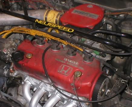
ick. so you can see what i wanted to get rid of.
so i thought, and thought. considered a flip paint - too rice. considered a candy paint - too garish. then, while working on one of the many LBC's i see at work, it hit me: hammertone!
many older British cars had hammertone valve covers - they used it because it hid the cosmetic issues involved in the craptastic stampings they were using. but i thought it would lend an "olde worlde" sort of feel to my engine bay - kind of a shout-out to my automotive background in MGs and Triumphs. so i stripped the old paint and laid a few coats of Krylon "industrial" hammertone silver down:
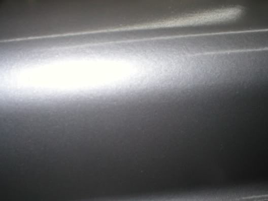
you can barely see the stippled effect hammertone paint has - but it's there.
as a further sop to my "old world sensibilities," i decided to do something a little different with the lettering. instead of sanding and polishing it (as per usual), i decided to get a copper "foiling" pen and detail the letters in copper. actually a thin clear paint with copper suspended in it, i think it looks pretty good, though i'm going to need to touch up a little around the "H" logo:
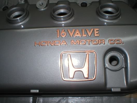
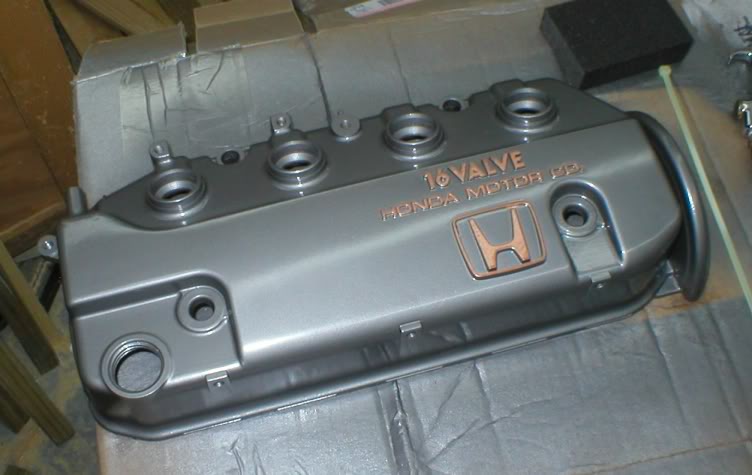
so overall, i think it's going to be a nice change under the bonnet when i get it bolted down...
so i'm dog- and house- sitting for my parents while they are on holiday in Ireland for two weeks. since i've got multiple alternate modes of transportation while they are gone (even i can't drive six cars at once), i figured i'd go ahead and do the MPFI conversion on my EE2. since i was going to be working on it then, i decided to do some other stuff - set the valve lash (about 50k miles overdue), paint header (since the 7 year old ceramic coating is beat up, and it's getting rusty), oil change (hey, at least this is early), and re-paint my valve cover.
several years ago, i did the usual ricer thing and painted it red. in my defense, the original wrinkle finish was totally fubar. still, red may not have been the most tasteful choice.

ick. so you can see what i wanted to get rid of.
so i thought, and thought. considered a flip paint - too rice. considered a candy paint - too garish. then, while working on one of the many LBC's i see at work, it hit me: hammertone!
many older British cars had hammertone valve covers - they used it because it hid the cosmetic issues involved in the craptastic stampings they were using. but i thought it would lend an "olde worlde" sort of feel to my engine bay - kind of a shout-out to my automotive background in MGs and Triumphs. so i stripped the old paint and laid a few coats of Krylon "industrial" hammertone silver down:

you can barely see the stippled effect hammertone paint has - but it's there.
as a further sop to my "old world sensibilities," i decided to do something a little different with the lettering. instead of sanding and polishing it (as per usual), i decided to get a copper "foiling" pen and detail the letters in copper. actually a thin clear paint with copper suspended in it, i think it looks pretty good, though i'm going to need to touch up a little around the "H" logo:

so overall, i think it's going to be a nice change under the bonnet when i get it bolted down...

Comments
I like the copper highlights too.
that's one of the reasons i picked it - i work on old Jags all day. well, and R-R/Bentley, and Morgan, and MG, etc...